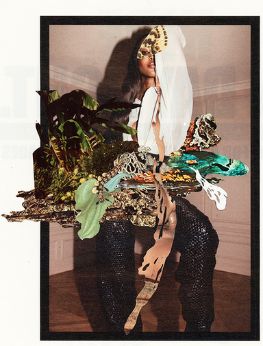
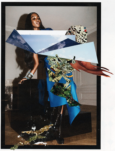
One of our assignments was to visit a photography gallery and respond through our own piece. I chose to go to the White Petals Surround Your Yellow Heart exhibit at the Institute of Contemporary Art which is practically on Penn's campus. The entire exhibit illustrated various views on fashion, self-adornment, clothing, and texture. Some pieces such as Aura Rosenberg, John Miller, and Frank Lutz’s Carmen’s Fashion Do’s and Dont’s that featured a young girl and her brother in various fashionable clothing. While highly stylized, speech bubbles, colorful backgrounds, and humorous text complemented the images. For example, four images together were titled “Almost anything can make a great earring…almost!” with images of Carmen wearing buttons and bananas on her ears. Furthermore, Anne-Mie Van Kerckhoven’s pieces, Youth Code and NonPlus, incorporated photography with many other materials such as paint, different textured paper, magazines, pen, and more. Finally, the three photographs that stayed with me the most, were Wardell Milan’s Naomi and Landscape #1, 2, and 3. The three images contained a striking model in haute-couteure fashion with other prints and collages covering parts of her outfit or body. The prints were reminiscent of National Geographic pieces, ranging from flowers to deserts to the open sky. Though there was not an artist’s statement included with the pieces, I felt that the work was combining the two worlds of fashion photography: the models on the pages and the girls who read the magazines. The way that the shapes were cut out and pasted alluded to the way young girls crudely cut out their favorite images, pasting them in collages or on their walls. Because the additional work was done on the computer, it was almost unusual to see how flat the print was. The landscape images created new outfits, obscuring what Naomi was originally wearing.


 Ultimately, I was fascinated by the various ways that photography was combined with different elements. From speech bubbles to paint to computerized “collaging,” it really opened up my eyes to the various ways that photograph and other mediums can be combined with one another. I took multiple shots of nature: flowers, grass, branches, etc. I then cut some of them out similar to Wardell Milan's work, but also experimented with different layers and backgrounds.
To be totally honest, I'm not sure how much I am a fan of this type of photography. I think I need to experiment a little bit more with collaging to see what style I like. I do like the layering effect, though. I think it would be quite beautiful to overlay a lace image over a portrait. As much as I love modern art, I'm realizing that when it comes to people, I lean towards what I consider beautiful and elegant. Perhaps I could try this style with inanimate objects and see if I would enjoy that more. Images from Wardell Milan and ICA

